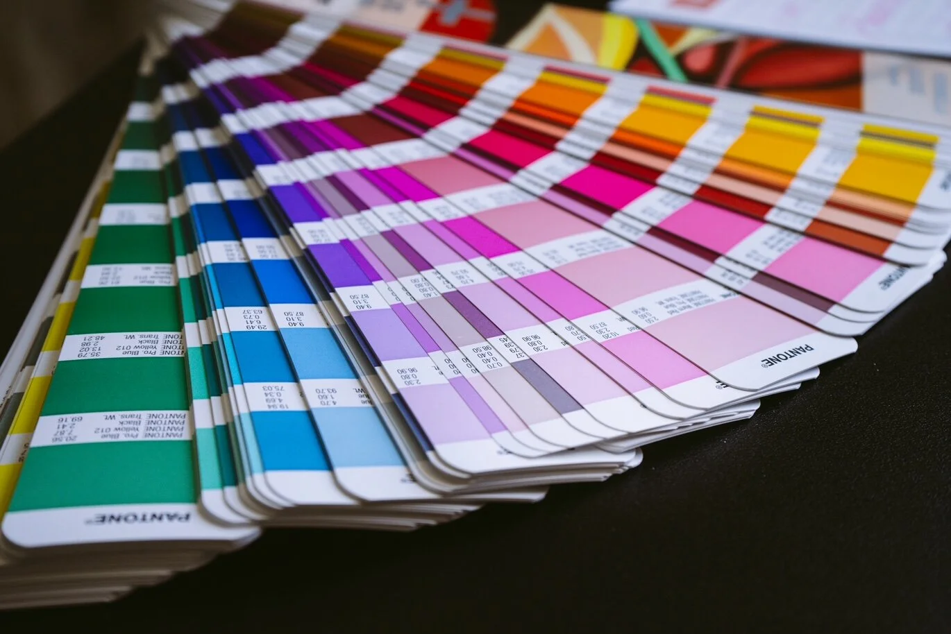
Your brand color palette is so important!
Are you looking to find the perfect set of colors to help represent your brand? Maybe you have a color palette you chose previously, but it’s not sending the right message to your audience.
Color plays a fundamental part in our lives because it helps communicate ideas and trigger certain emotions.
For example, green means go, yellow means yield and red means stop. This set of colors has been engrained in us from a very early age.
There are many colors that, when combined, in our minds, can represent a specific brand.
If someone asks you to grab food from the "red and yellow" restaurant, where are you going? McDonalds.
If someone asks you if you want to go out for coffee at the "green and white" coffee shop, where are you going? Starbucks.
Whether you are just launching your business, or are planning to update your color palette; it’s important that your brand colors align with your brand personality.
Let's talk color psychology!
Colors have a perceived meaning and can make you feel an abundance of emotions when you view certain colors.
Red is a strong color that can trigger very different types of emotions. On one hand, it can stand for love, passion or power, but on the other hand it can mean alert or danger.
Orange signifies optimism, fun and creativity. This color tends to be used in travel and entertainment brands.
Yellow gives viewers a sense of happiness, energy, joy and enthusiasm. It is used to stimulate and give off a positive energy; mainly used in wellness industries.
Green stands for life, nature and growth, which is utilized by many wellness, health and natural beauty brands focusing on sustainability and environment.
Blue gives a sense of loyalty and security to the viewer. A darker blue may be used in finance and tech brands, while lighter blues are used in many baby products.
Purple is all about creativity and imagination. It can give a sense of mystery and can feel very luxurious and royal.
Black signifies authoiry and elegance and can be used in so many different areas of business. It is rare that black is used on its own in branding, but can be paired with so many different colors on the color wheel.
White is pure, simplistic and can be soothing to the viewer. It is most often used in combination with other colors and is used to make colors pop off of the page.
What does our color palette say about us?
Alara Design Studio has a color palette that uses a mixture of black, white and mauve. The overall message these colors send to our audience is elegance, simplicity and creativity, all wrapped up in one beautiful color palette package.
So what does your color palette say about you?
Let's work together to design and launch your perfect color palette!
